Design Background
MTP (Mapping the Prompt) maps intent to a discrete color grid instead of relying on long verbal prompt instructions. This document explains the design rationale for that grid: why the layout is 3×3, why Transparent sits at the center, and how the surrounding colors relate to both Yin–Yang and Five-Elements thought and a hue cycle.
3×3 grid
Section titled “3×3 grid”The core of MTP is a 3×3 grid of nine cells (nodes). Each cell carries both a color identity and a semantic role.
+-----------------+-----------------+-----------------+| Yellow | Red | Magenta |+-----------------+-----------------+-----------------+| Green | Transparent | White |+-----------------+-----------------+-----------------+| Cyan | Blue | Purple |+-----------------+-----------------+-----------------+In implementation, this macro layout expands into a 19×19 coordinate grid. Behind this arrangement lies a distinctive design that overlays two organizing principles:
- A directional reading drawn from Wu Xing (Five Elements).
- Corner placement along a discrete hue cycle.
Wu Xing directions and hue-cycle corners are combined in one layout. This is not offered as the authoritative arrangement for cultural or intellectual history; it is explained as a mnemonic for which semantic direction each node faces.
Design Visualization
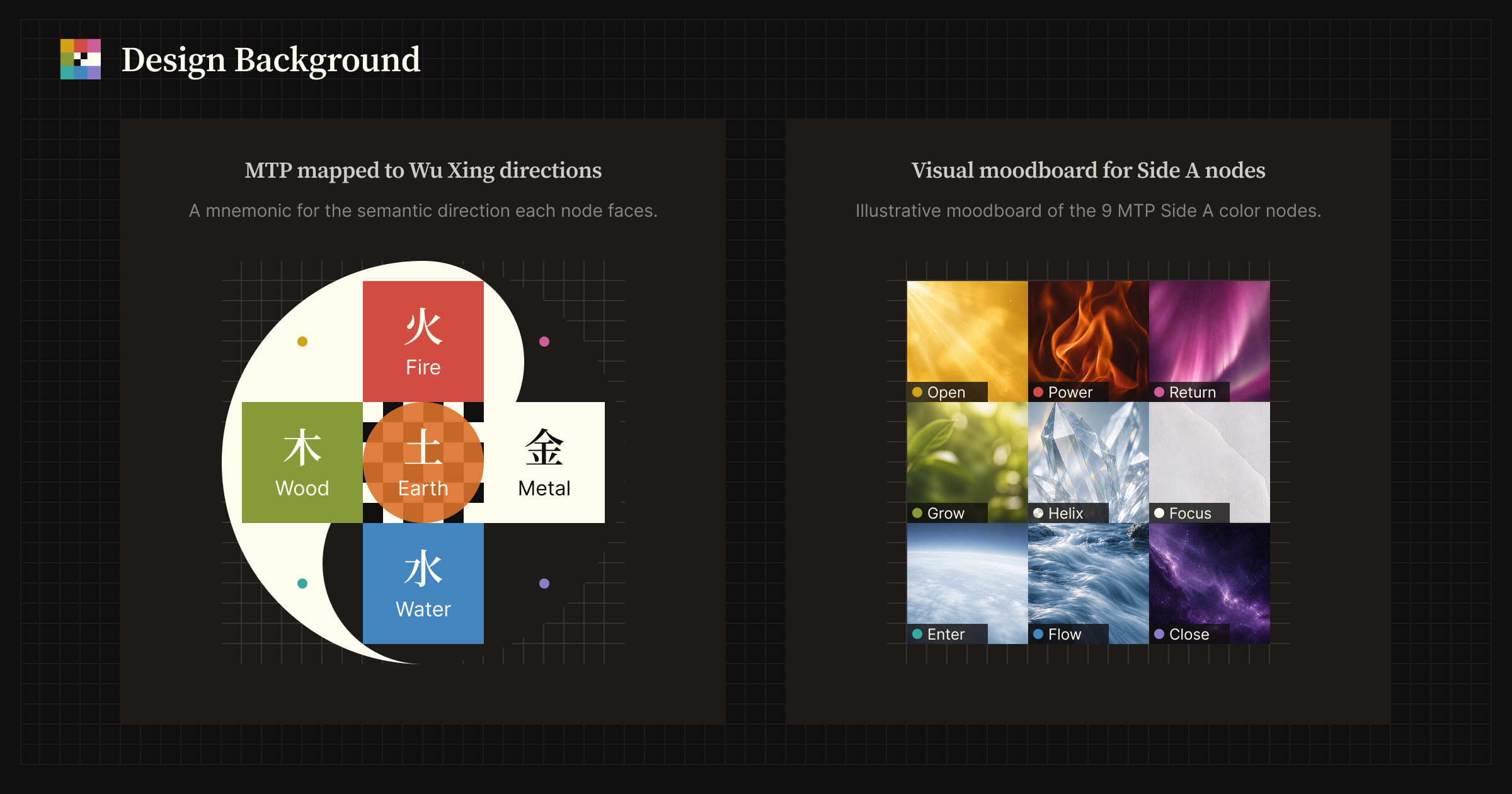 MTP maps the 3×3 Side A node layout to Wu Xing-inspired semantic directions, then visualizes each node as an elemental moodboard image.
Why the center is Transparent
Section titled “Why the center is Transparent”The key to the center is the role of Earth (土) within Wu Xing — in the Five-Elements palette often associated with yellow or brown. Wood, Fire, Metal, and Water occupy directional positions; Earth occupies the center. Here, Earth is not read as another outward-moving element, but as a medium or field that makes transition and balance possible.
+-----------------+ | Fire (South) |+-----------------+-----------------+-----------------+| Wood (East) | Earth (Center) | Metal (West) |+-----------------+-----------------+-----------------+ | Water (North) | +-----------------+“Earth” as spatial foundation
Section titled ““Earth” as spatial foundation”Relative to the four directions, the place from which orientation is taken is the center. In that sense, “Earth” is the ground on which the other phases unfold. The directional phases can oppose, generate, or transform one another, but the center remains the point that holds the system together.
“Earth” as seasonal converter
Section titled ““Earth” as seasonal converter”Wu Xing is often read through the seasons: Wood with spring, Fire with summer, Metal with autumn, and Water with winter. Earth does not claim an exclusive season of its own in the same way. Instead, it is associated with Doyo (土用), the transitional interval between seasons. Under that reading, Earth is the phase through which one season returns and another emerges. It is less a fixed season than a converter between seasons.
“Earth” as balancer
Section titled ““Earth” as balancer”Wood and Fire are commonly read as more Yang-oriented phases, while Metal and Water are more Yin-oriented. Earth occupies the balancing role between those poles. A direct jump from one extreme to another suggests rupture; Earth receives that change, steadies it, transforms it, and makes continuation possible.
“Earth” as field and Transparent
Section titled ““Earth” as field and Transparent”In MTP, the center (Earth) is Transparent, not yellow. Wood, Fire, Metal, and Water can be treated as directional vectors. Earth, in this reading, is different: it is the field or substrate that receives, supports, and mediates those vectors.
MTP encodes that role as Transparent (Helix) rather than as a fifth hue. The point is not “another color in the middle,” but a mediating center that stays off the hue poles while remaining involved in every direction.
The 4+1 pattern across world traditions
Section titled “The 4+1 pattern across world traditions”The layout also connects to a broader 4+1 motif found in multiple traditions: four directional poles plus one mediating center. Greek discussions of Aether and Indian discussions of Akasha provide loose analogies. In MTP, however, the main anchor remains the Wu Xing reading of Earth-as-medium. Cross-cultural comparison is a teaching aid, not evidence. The layout is not intended as a mystical reading; it points to a shared intuition about nature and placement — for example, fire rises and water seeks the low — rather than serving as proof of a single esoteric schema.
For example, Red and Blue form a strong vertical opposition, Green and White form a horizontal complement, and Transparent mediates between them without becoming a directional pole itself.
From Five Elements to nine colors
Section titled “From Five Elements to nine colors”Wu Xing provides five named phases, while the grid has nine cells. The difference is handled by using the Five Elements as the cross skeleton and assigning the four corners to transitional positions between adjacent phases. Those transitions are then aligned with intermediate hues on a standard hue wheel.
Cross skeleton
Section titled “Cross skeleton”| Direction | Five Elements | Grid position | MTP color |
|---|---|---|---|
| South | Fire | Top center | Red |
| East | Wood | Middle left | Green |
| Center | Earth | Center | Transparent |
| West | Metal | Middle right | White |
| North | Water | Bottom center | Blue |
The Metal → White correspondence reflects a design association of brightness and reflectivity. It is a metaphor within the grid design, not a physics claim.
Corners as transitions
Section titled “Corners as transitions”| Position | Adjacent elements | Seasonal transition | MTP color |
|---|---|---|---|
| Top left | Wood(Green) ↔ Fire(Red) | Spring → Summer | Yellow |
| Top right | Fire(Red) ↔ Metal(White) | Summer → Autumn | Magenta |
| Bottom left | Water(Blue) ↔ Wood(Green) | Winter → Spring | Cyan |
| Bottom right | Metal(White) ↔ Water(Blue) | Autumn → Winter | Purple |
On HSV/HSL, Yellow sits between Green and Red (roughly 60°), and Cyan between Green and Blue (roughly 180°). That is close enough to standard hue order to give the corner placements structural coherence. Again, the point is design alignment, not a rigorous derivation from color science.
Structural properties of the grid
Section titled “Structural properties of the grid”The preceding rationale can also be restated in structural terms.
Lattice embedding of the hue cycle
Section titled “Lattice embedding of the hue cycle”The hue cycle is normally continuous. MTP discretely embeds it into a 3×3 lattice as eight peripheral hues around a non-hue center. This preserves circulation around the outside while allowing the grid to function as a navigable coordinate surface.
Transparent as a medium node
Section titled “Transparent as a medium node”Many color systems place an achromatic value such as gray, white, or black at the center. MTP chooses Transparent instead. That decision treats the center not as a neutral color sample, but as a medium-like node: colorless in itself, yet involved in the transmission and integration of surrounding directions.
Z-order and semantic movement
Section titled “Z-order and semantic movement”Scanning the 3×3 grid from top-left toward bottom-right in a row-wise zigzag (Z-order) yields this color sequence:
Yellow → Red → Magenta → Green → Transparent → White → Cyan → Blue → PurpleThis ordering has structural significance within the macro layout.
- Warm-to-cool tendency by row: Roughly, the top row reads warmer, the middle row more neutral / mediating, and the bottom row cooler. This is a loose visual reading, not a strict color-temperature or scientific claim.
- The middle row of three: Green (chromatic) → Transparent (medium) → White (achromatic leaning) sit in one row. This can be loosely related to how hue and lightness axes intersect in classical opponent-process accounts — as an analogy for looking at the design, not a derivation from color science.
In image processing, Z-order is often just a traversal sequence chosen for computational efficiency. In MTP, the same ordering can also be read as a color trajectory through the space. It can help when thinking about semantic trajectory across ordered tokens or presets.